Portal
Rebranding • Visual ID • Logo Redesign
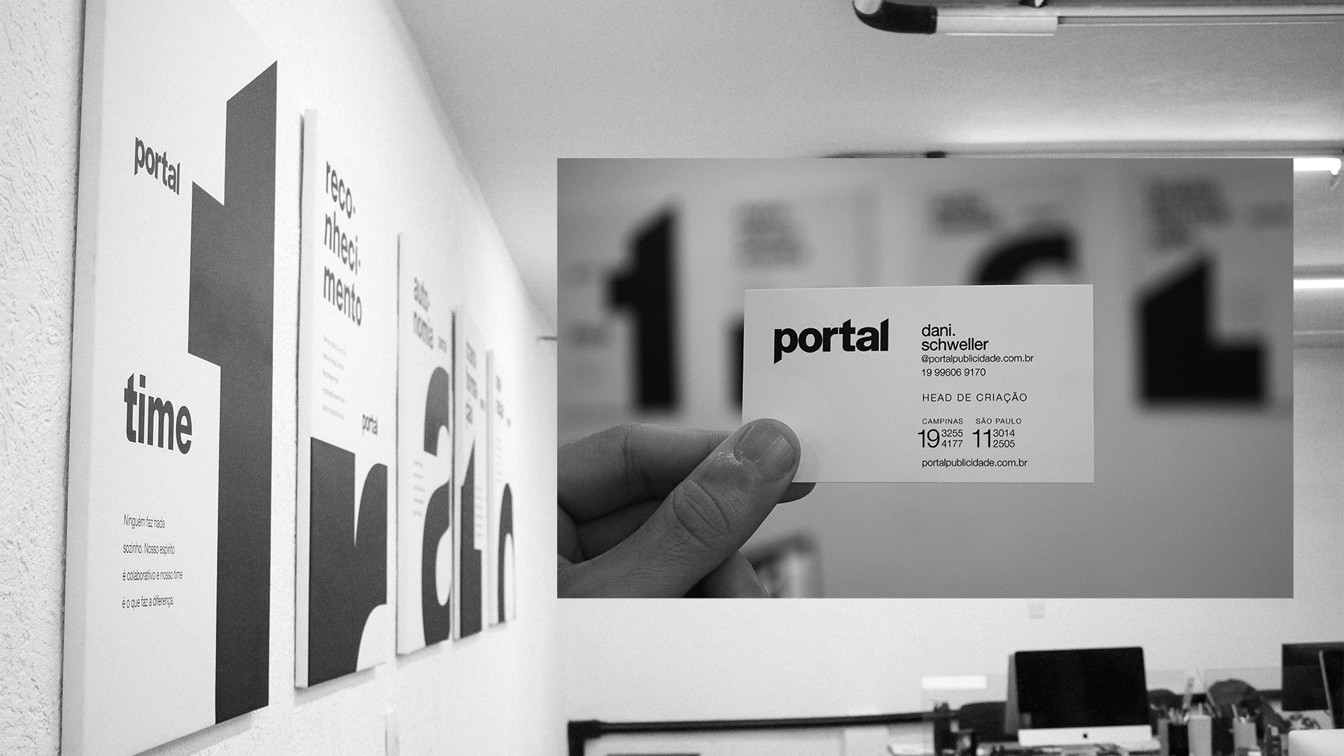
If Portal's work is based on the brands it serves, its new visual identity should be based on it's own brand. The modernization of the agency's services and operations needed to be there from the root of it all: the brand. With that in mind, it was redesigned with subtle, yet meaningful changes, without neglecting the essence that already worked. The new identity is underpinned by the commitment to a new cultural ethos: TRATO (Portuguese for "deal"). TRATO also stands for Team, Recognition, Autonomy, Transformation and Operation. The formula for the work environment is pretty simple: if everyone commits to TRATO, everything will work out fine. Just like black on white.

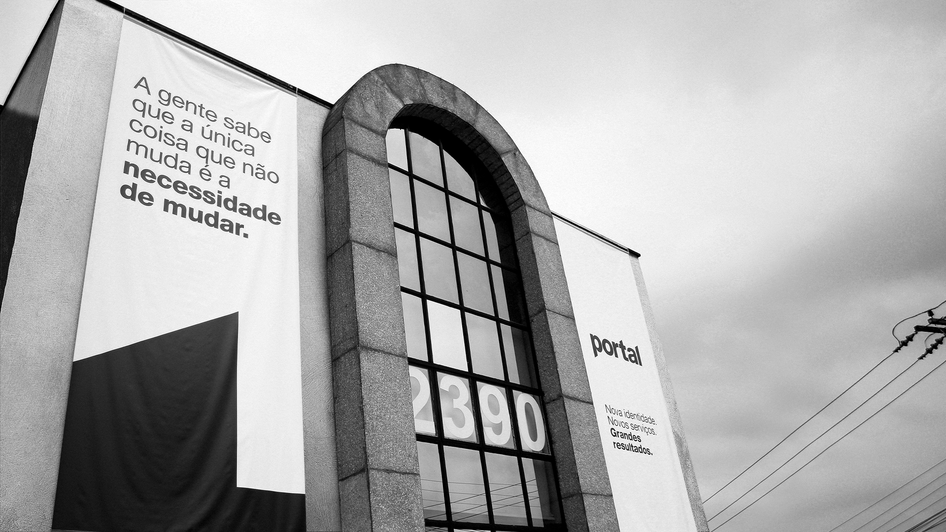
Left: We know that the only thing that never changes is the need for change.
Right: New identity. New services. Big results.
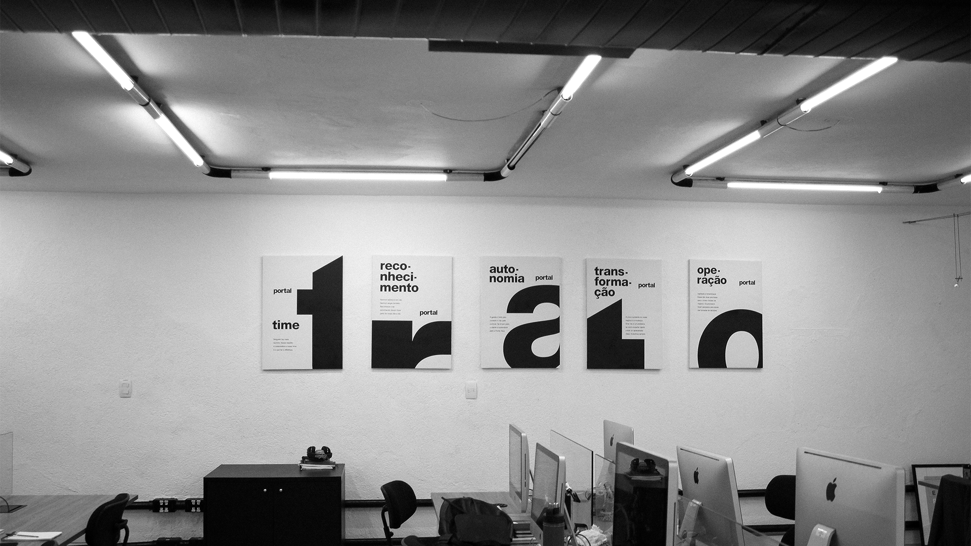 Team • Recognition • Autonomy • Transformation • Operation
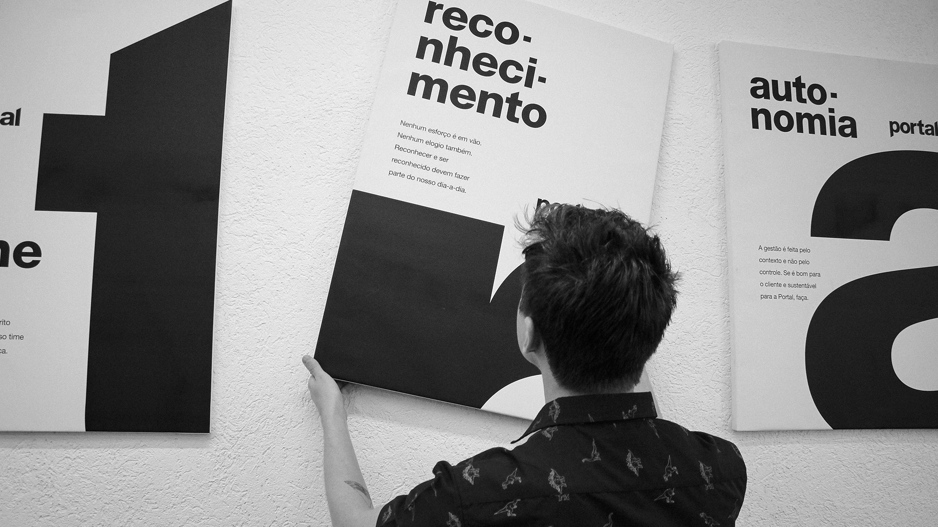 Recognition: no effort is in vain. No compliment either. Acknowleding and getting acknowledged must be part of our day to day.
Autonomy: management is about context, not control. If your idea benefits the client and is feasible for Portal, do it.

Photography: André Guimarães
Copywriting: Dani Schweller & Matheus Marin
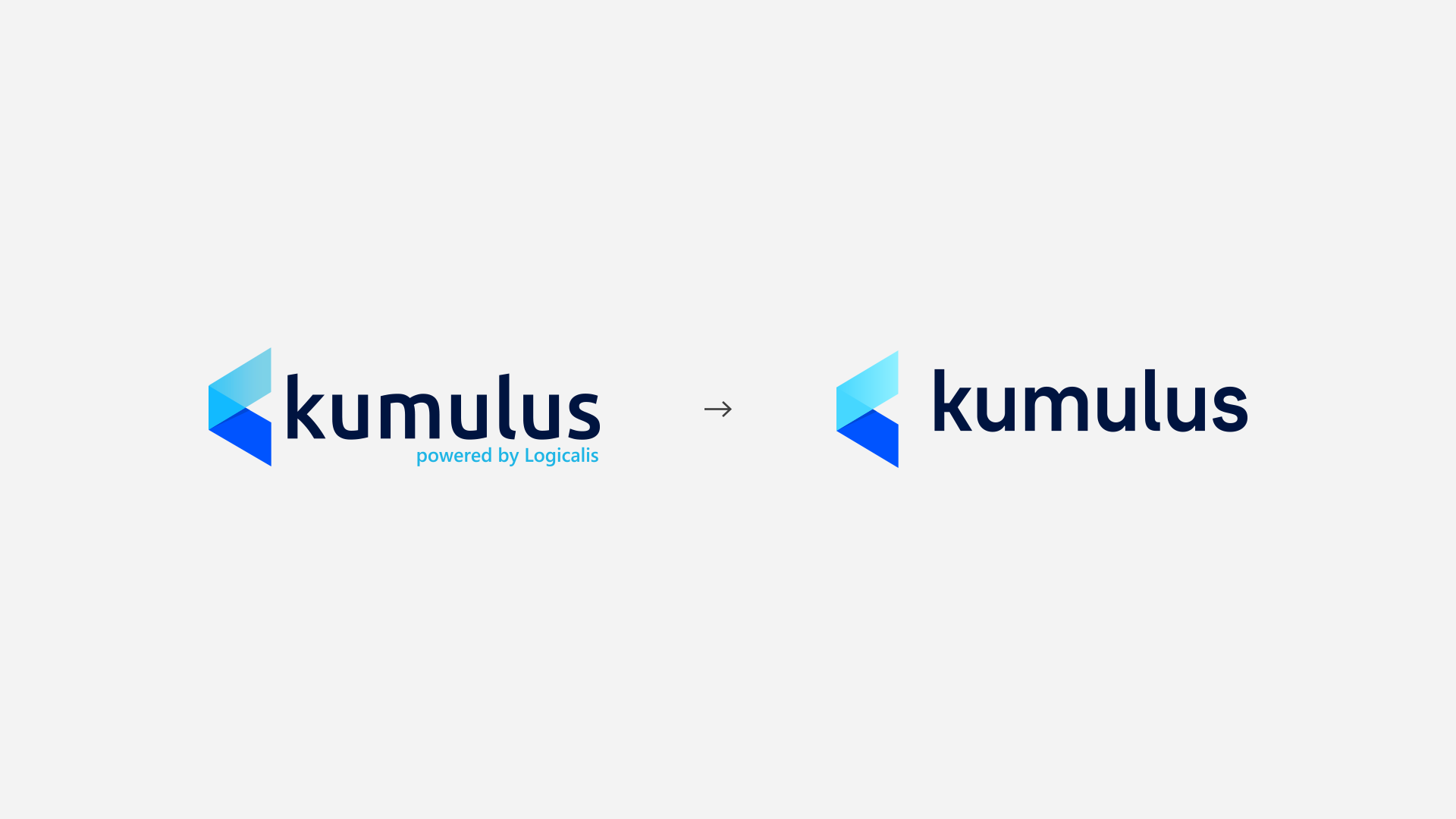
Kumulus
Rebranding • Visual ID • Logo Redesign
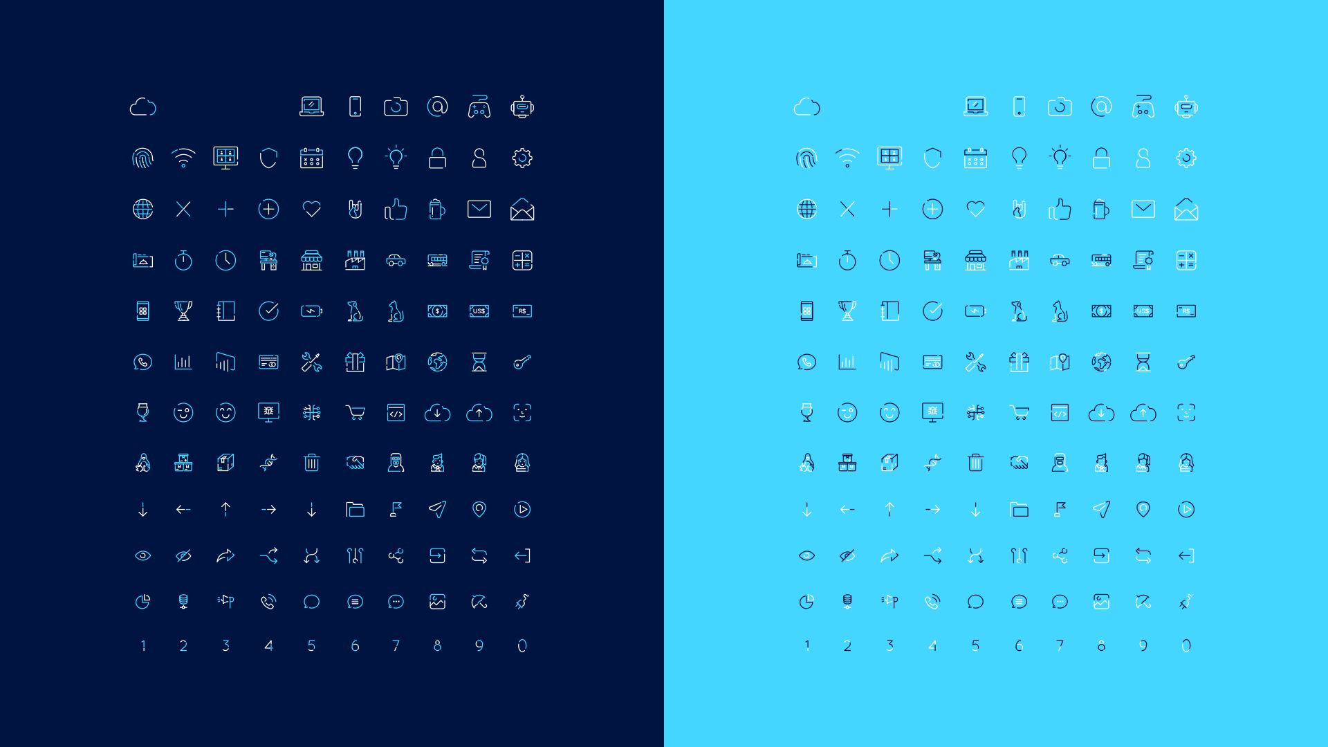
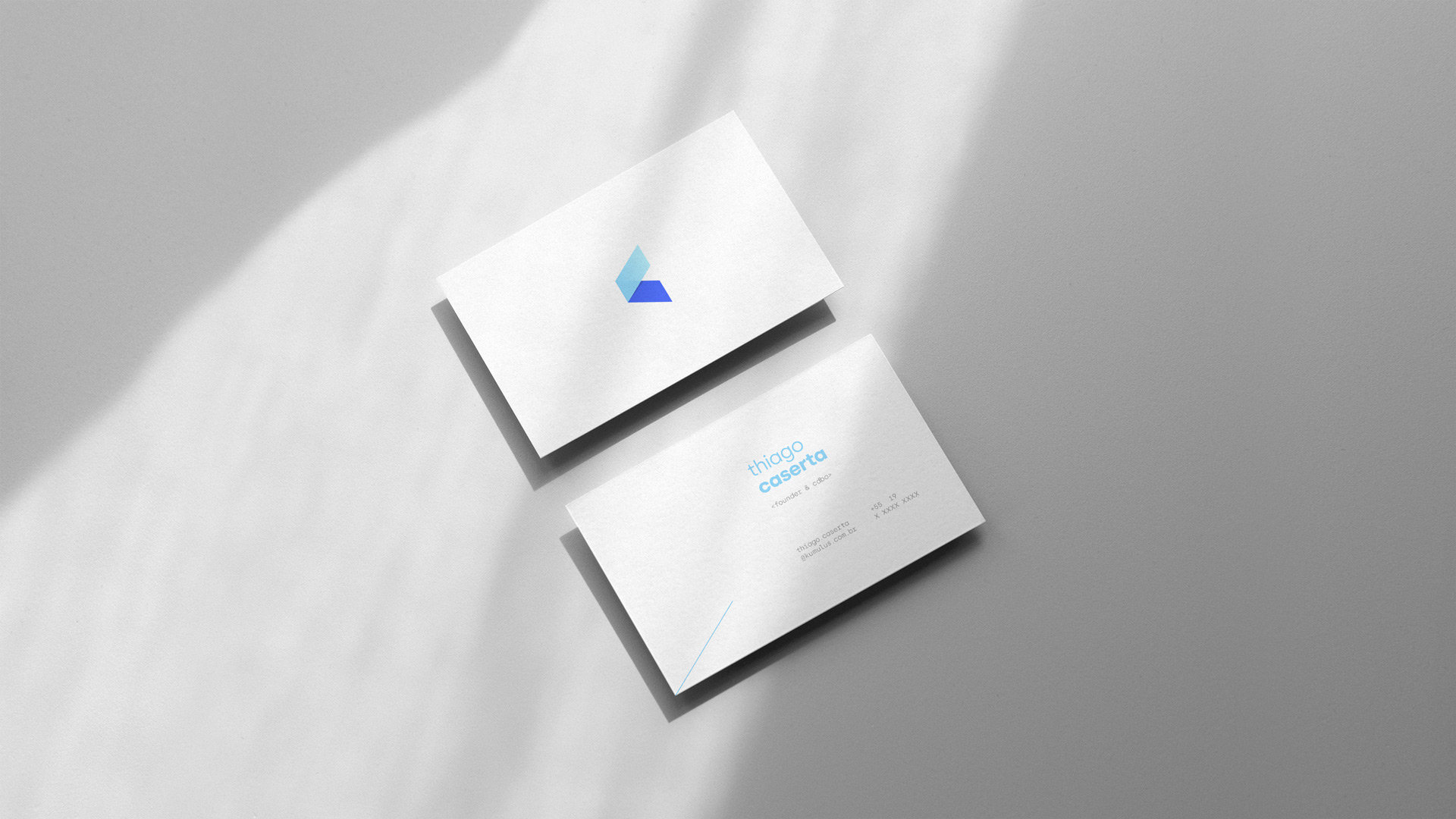
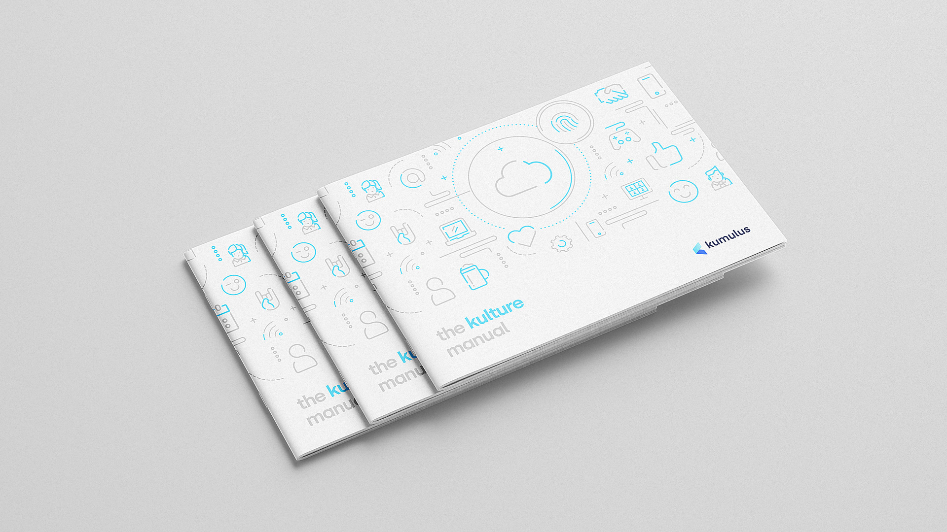
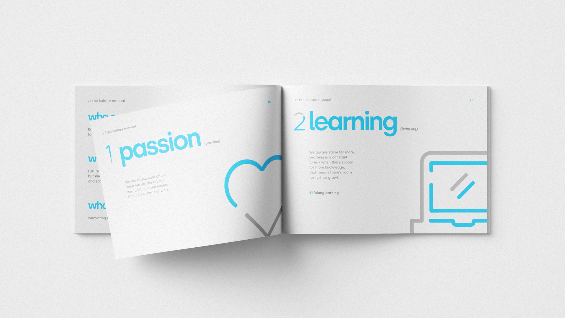
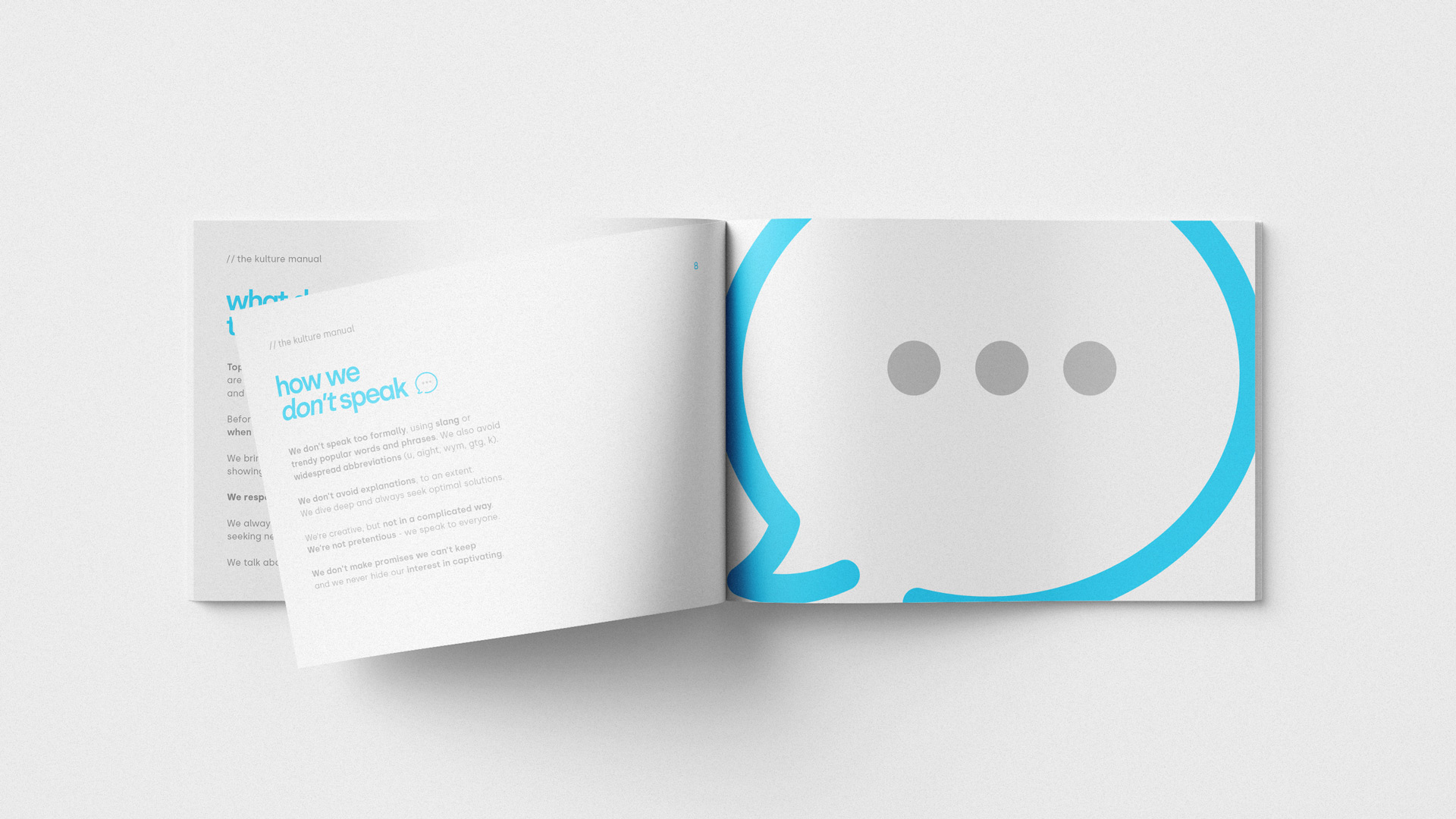
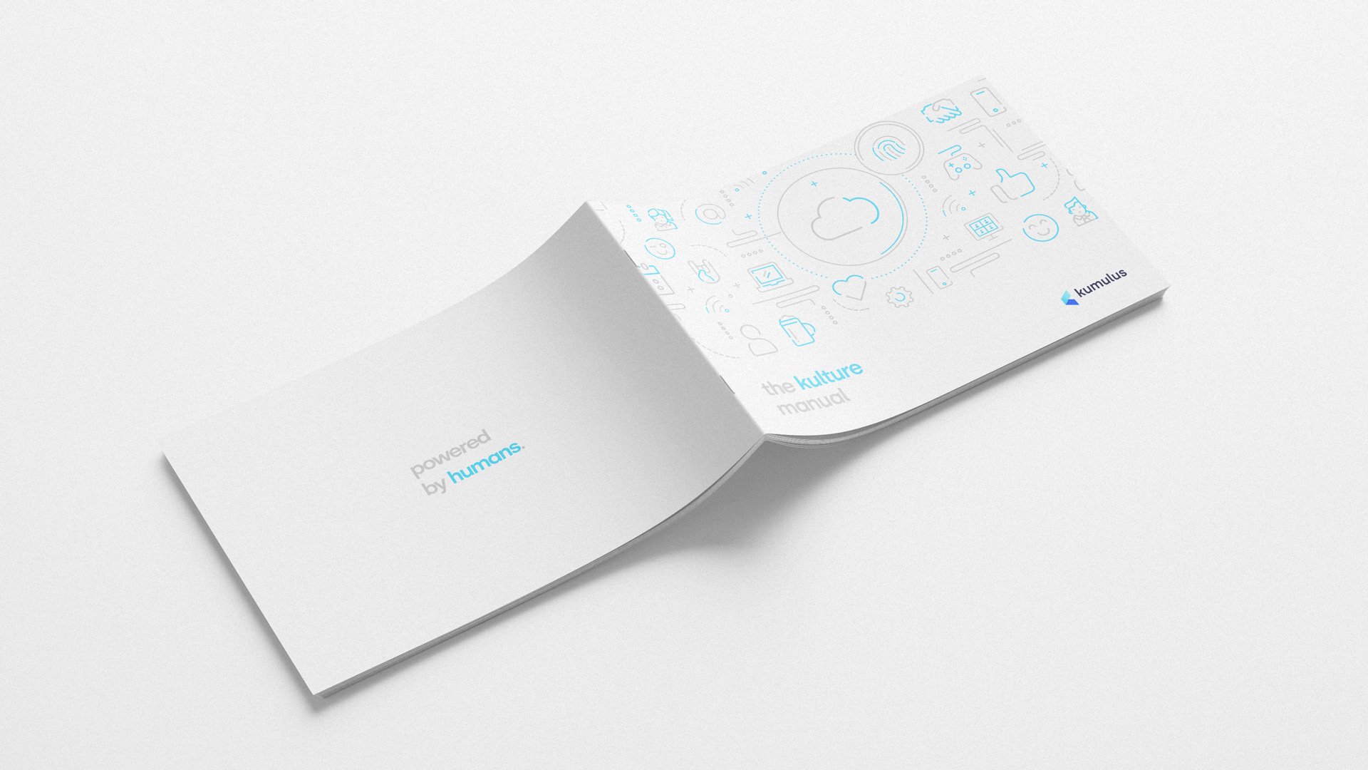
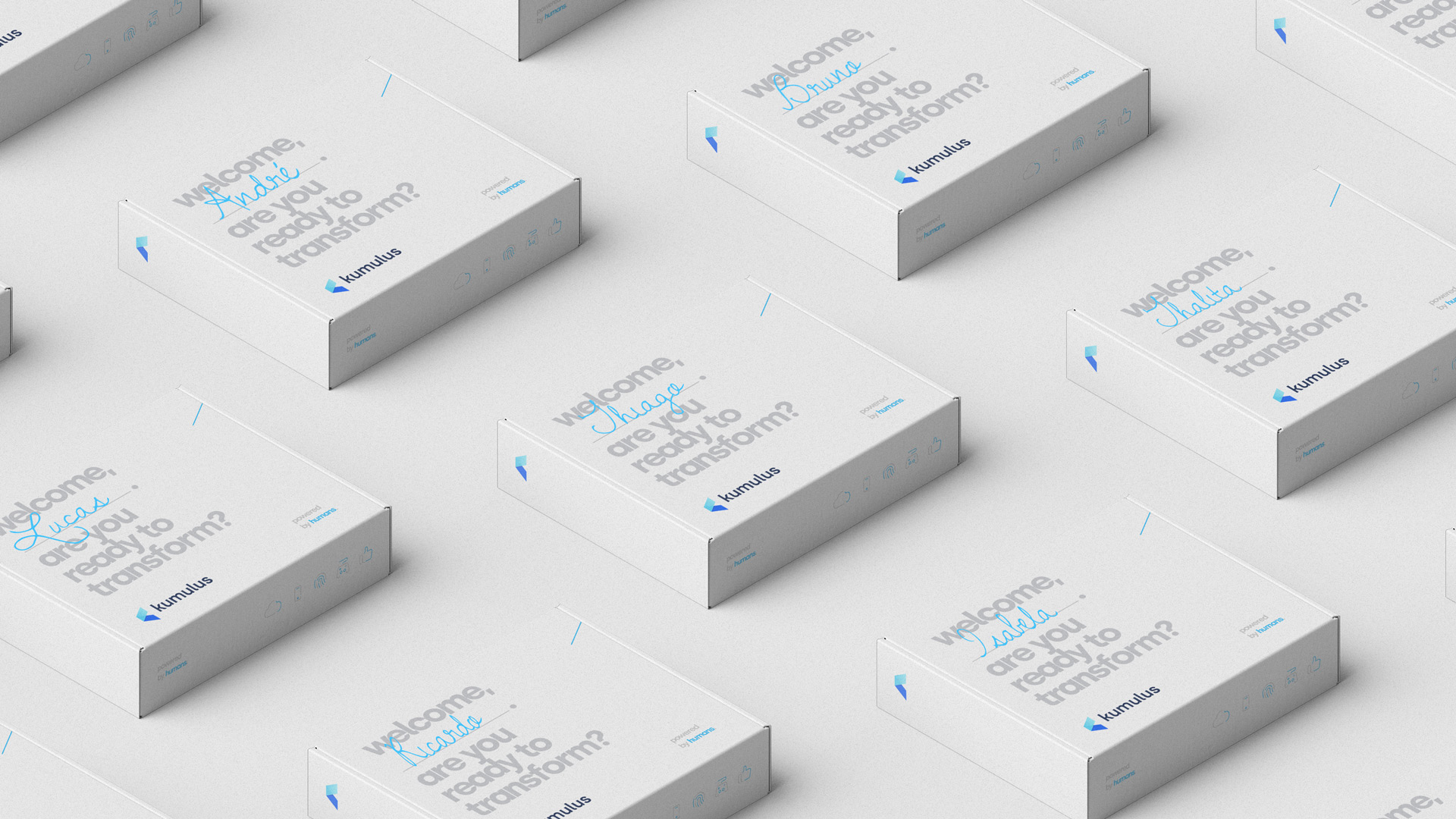
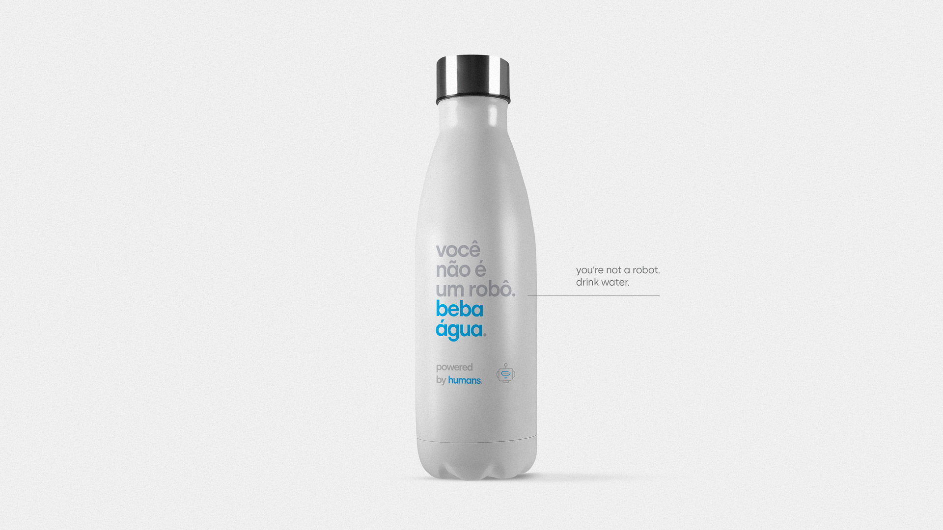
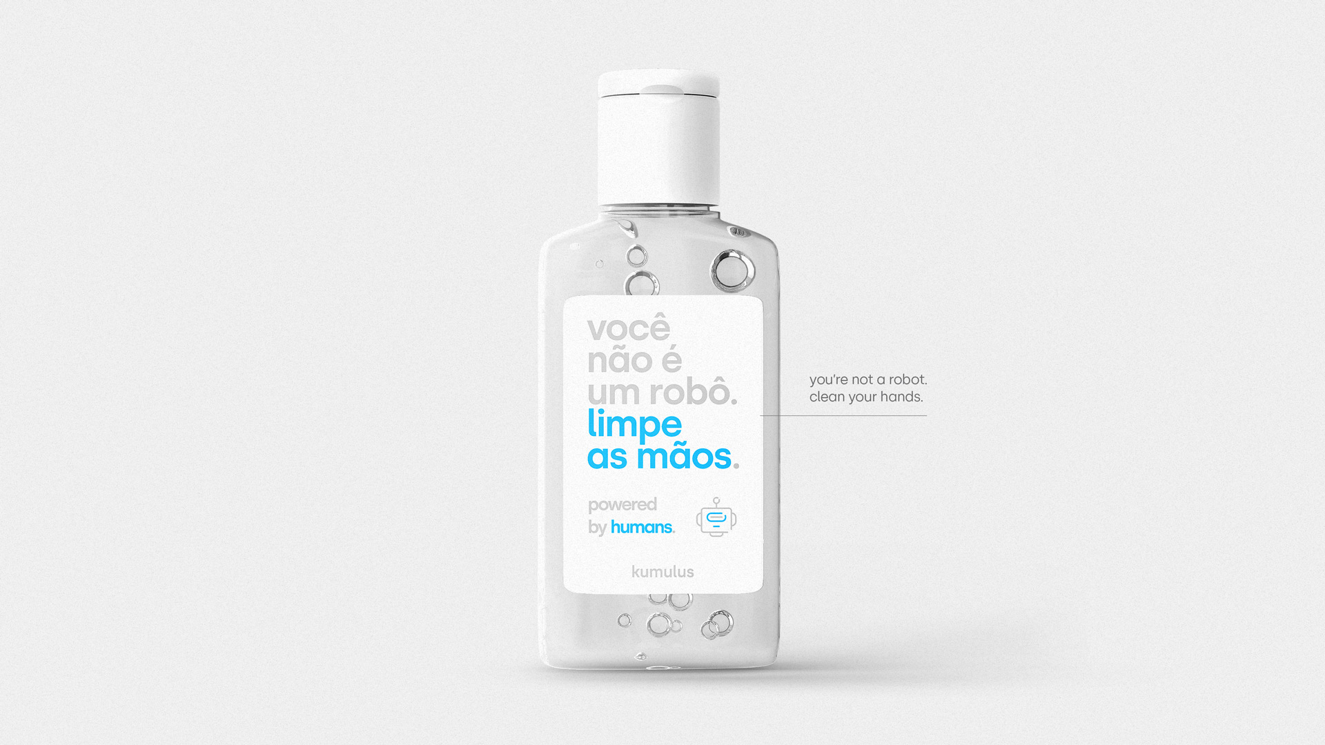
We were tasked with leading the company's rebranding project, which consisted of several stages, including conducting both internal and external interviews to determine how the company was perceived, then establishing it's core values, attributes and purpose, and only after all stages we began reshaping the brand and the visual/verbal identity. During that process, we came across an undeniable truth about tech companies that often gets overshadowed by the all the automation and, lately, AI: humans will always be at the heart of it. Kumulus is no different - it's powered by humans.

 Design & Art Direction: André Guimarães
Copywriting: Thiago Monferdini
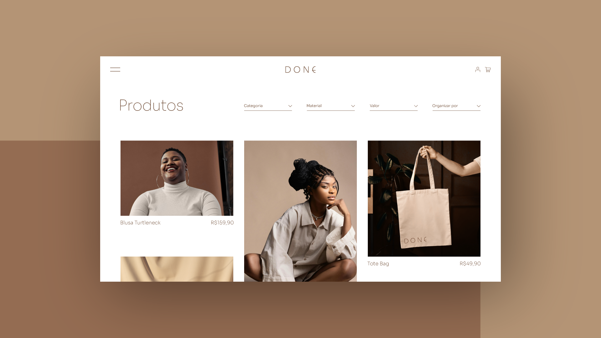
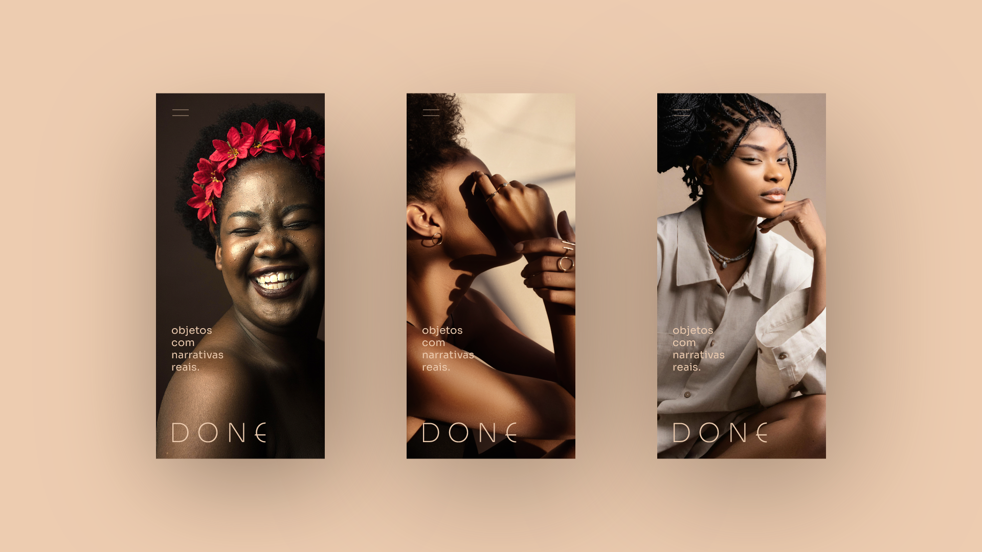
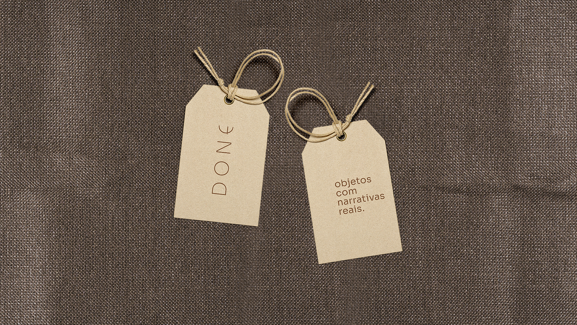
Done
Branding • Visual ID • Logo Design
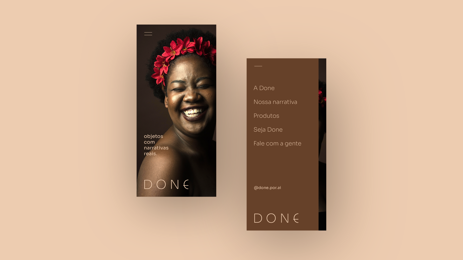
Done is an atelier where people turn discarded materials from a nearby sack factory into handmade objects and accessories. It also comes with a twist: all of their employees are transexual people who were once vulnerable and living on the streets (in the country with the highest number of transphobic violent crimes, on top of it), but who later got a new start to their stories. That's why, when tasked with this project, not only did we want to give the atelier a genderless name with a genderless brand, but we also felt the need to highlight the meaning behind the manufacturing of these products: they’re objects with real narratives, made from materials that were once discarded and by the hands of people who were once discarded. Substantial stories with newfound meaning.


Design & Art Direction: André Guimarães
Copywriting: Matheus Marin
Campinas Tech - Corporate
Innovation Forum 2019
Logo design • Visual ID • Event Concept
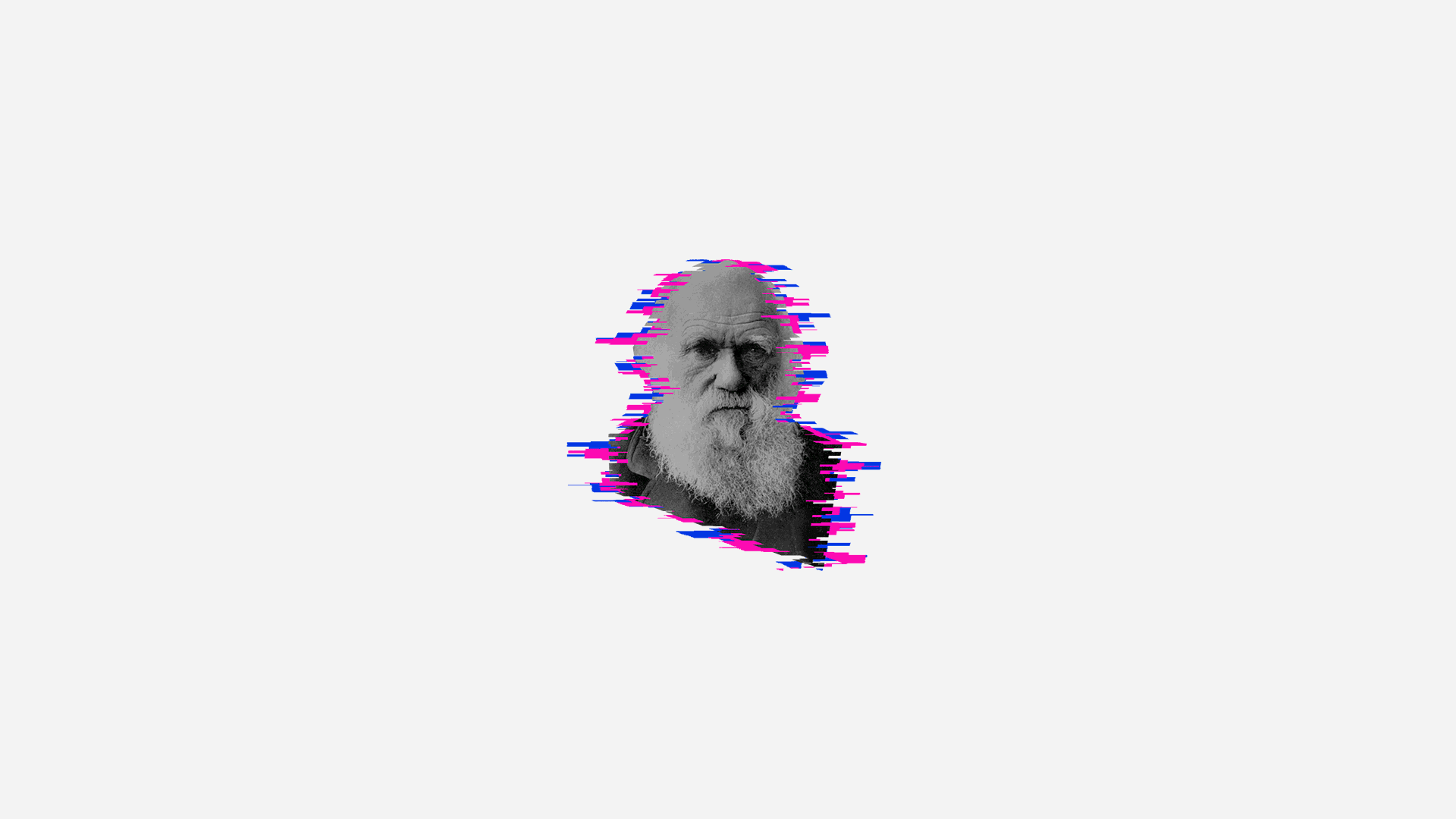
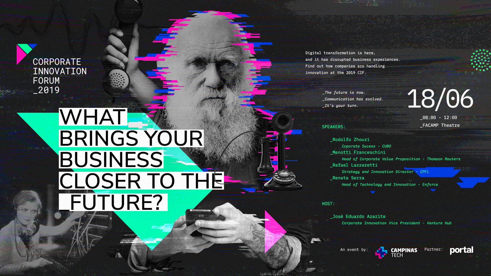
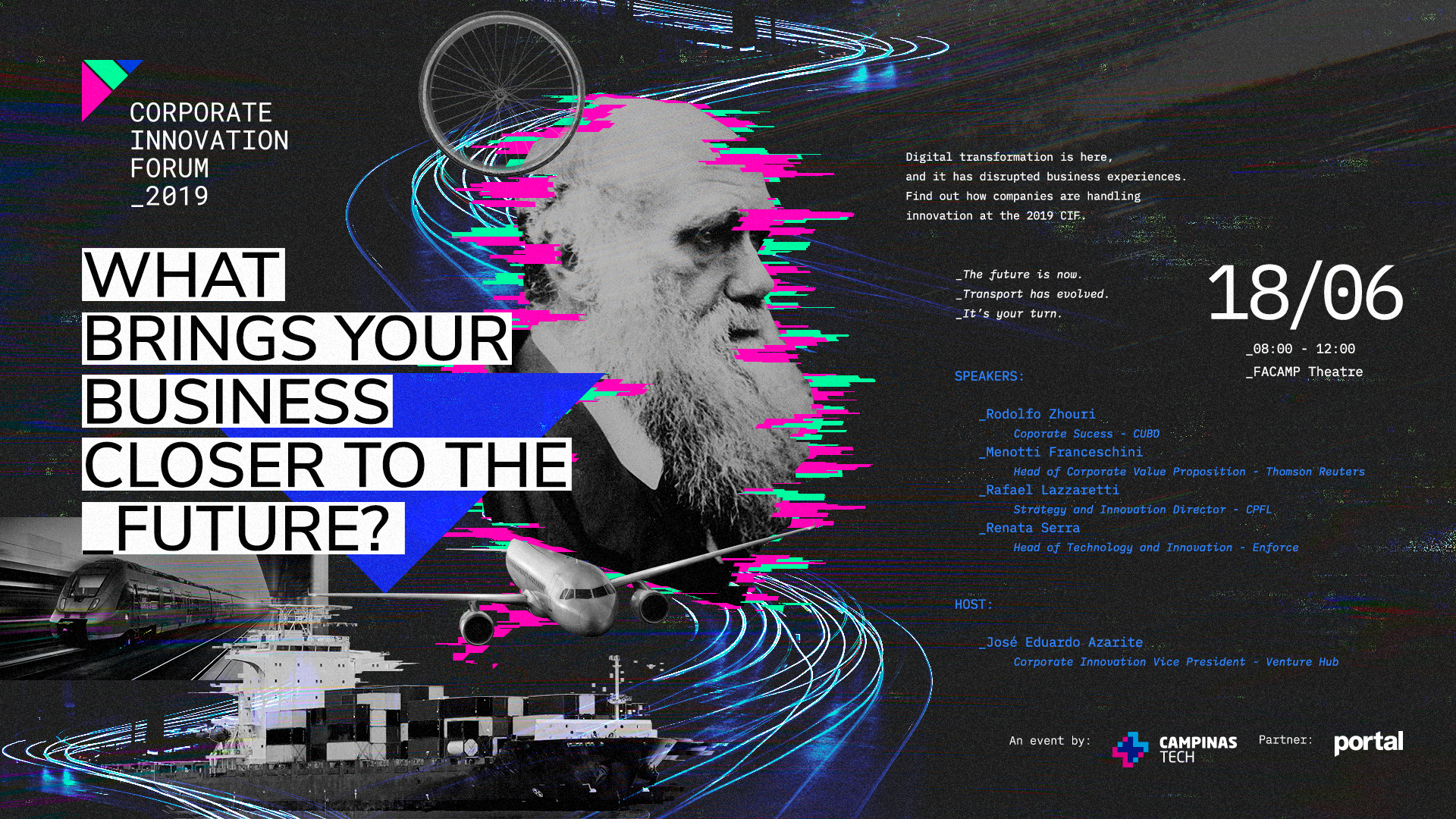
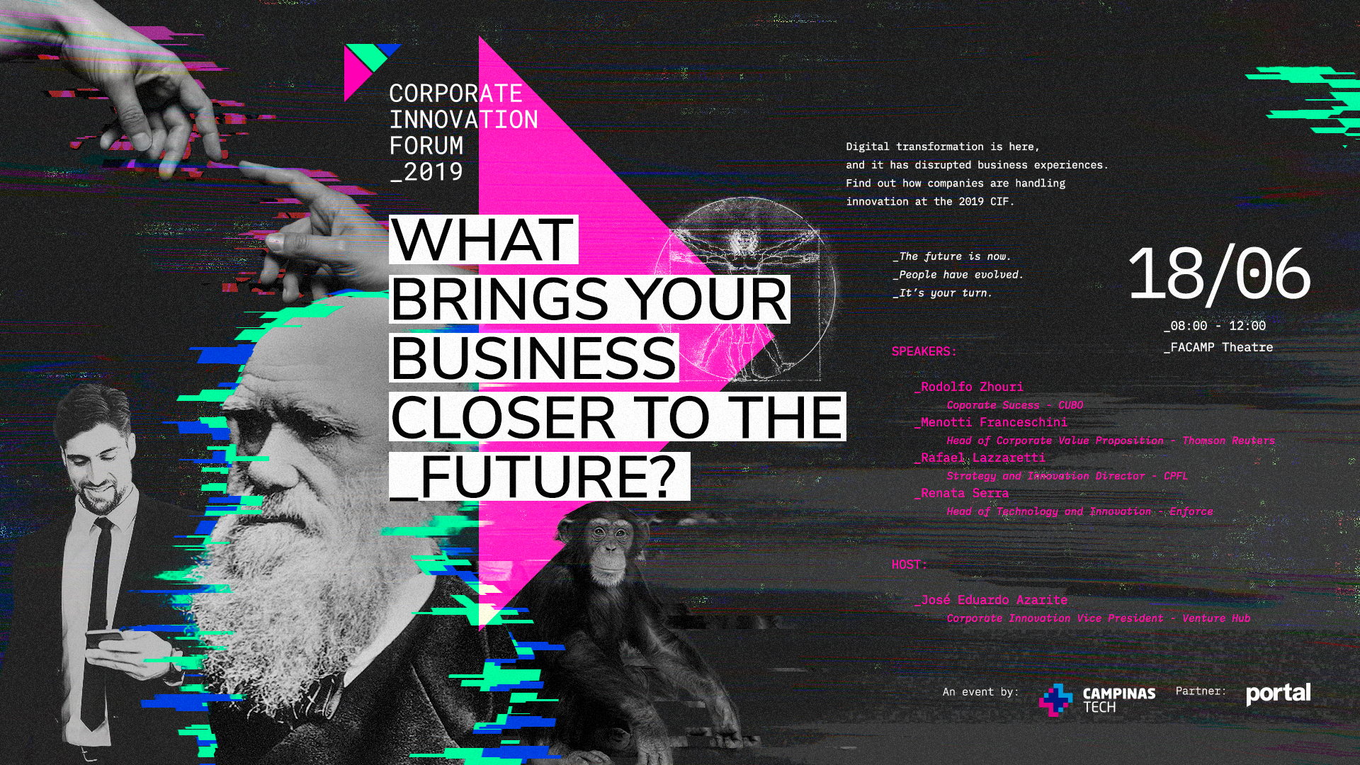
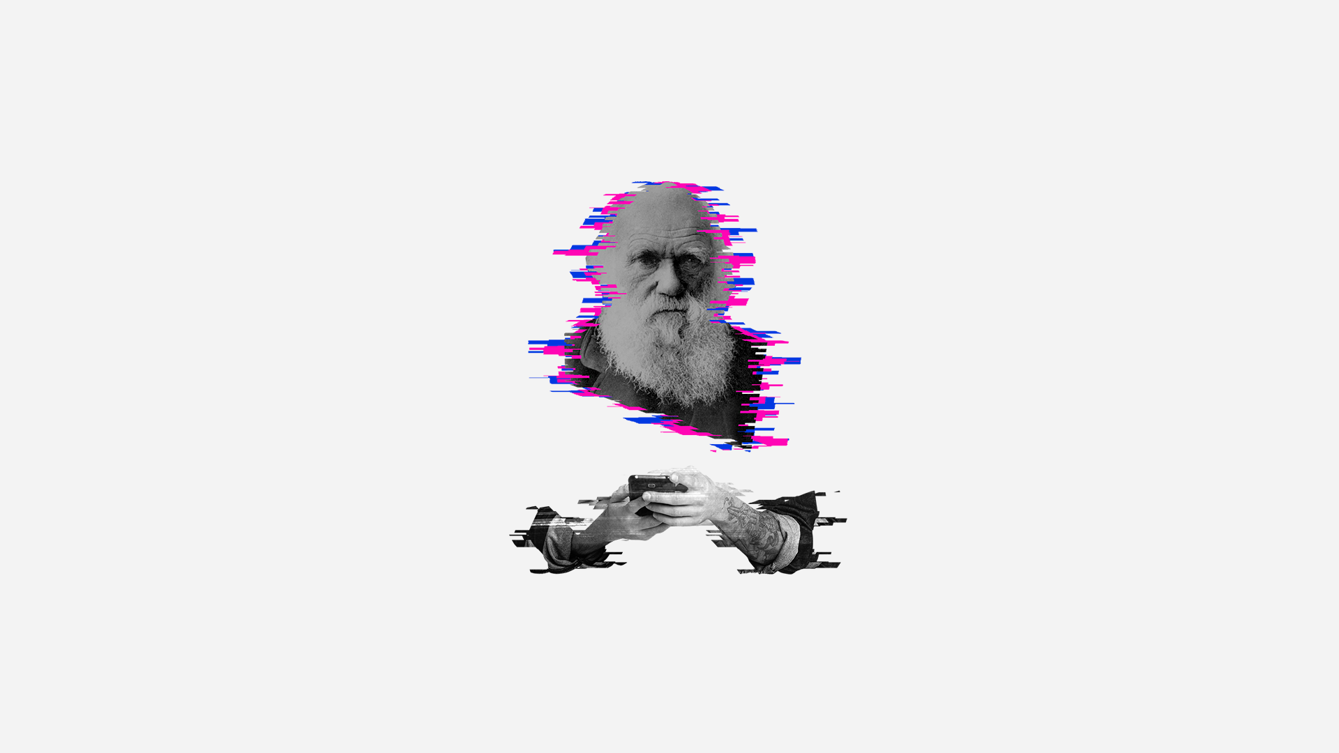
Darwin already said it in 1859: those who don't adapt will perish. In the corporate ecosystem, it's no different. The landscape is constantly changing and, in order to survive, companies need to look ahead and adapt to new external conditions. This was the concept brought by us to the visual identity of 2019's Corporate Innovation Forum, an event hosted by Campinas Tech where experts discussed technology, innovation and future trends in key aspects of people’s lives, such as communication, transport and relationships. The animation below shows how the concepts of evolution and adaptation were incorporated into the construction of the event’s logo. Darwin himself also made an appearance in the visual identity, so nobody forgets the core message. Now let's see who can thrive.

Design & Art Direction: André Guimarães
Copywriting: Matheus Marin
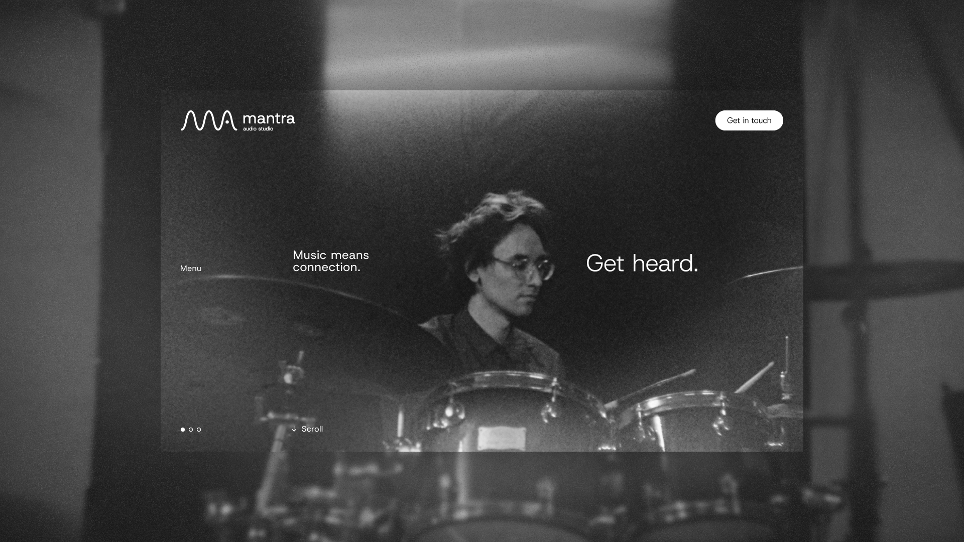
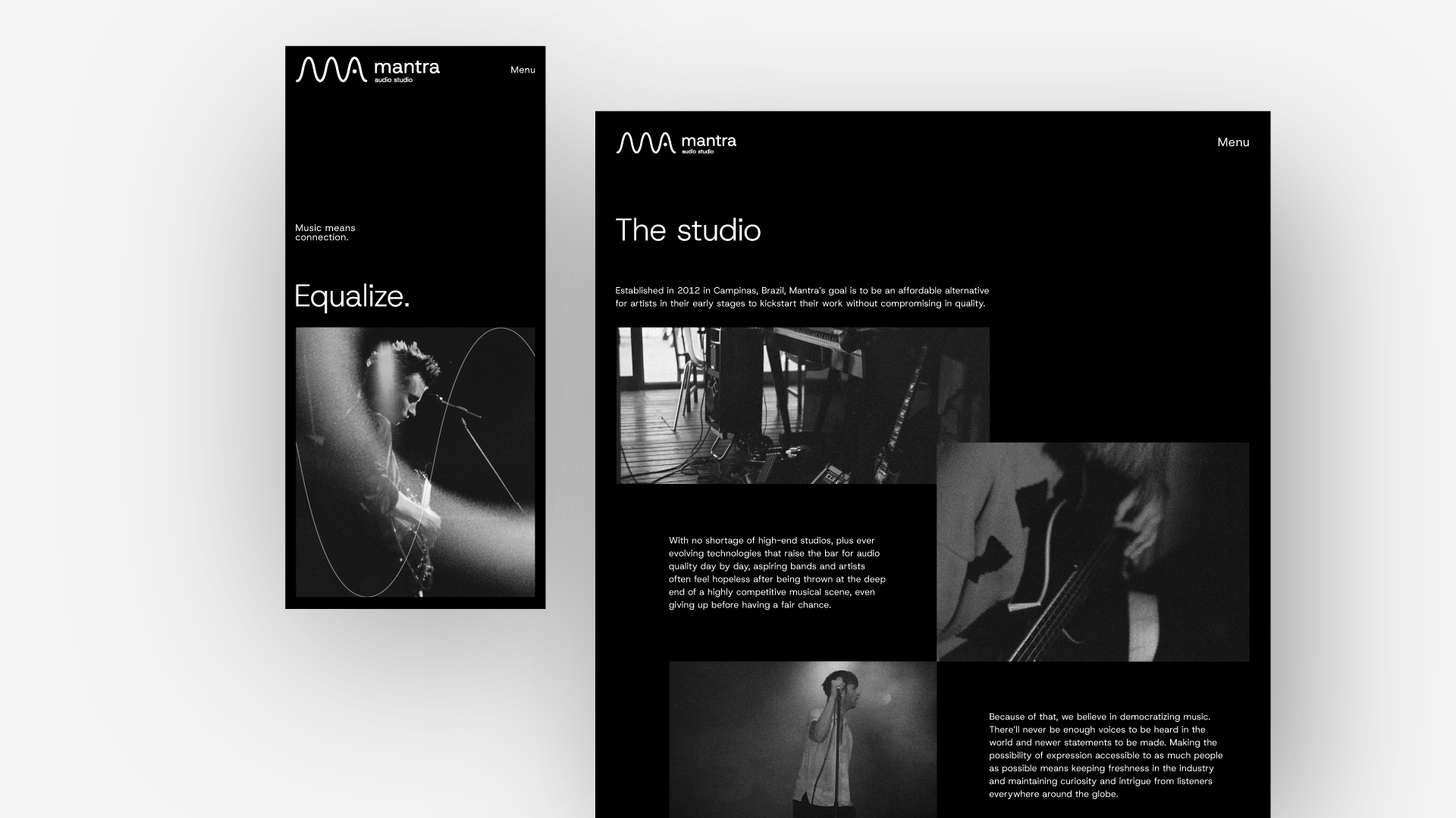
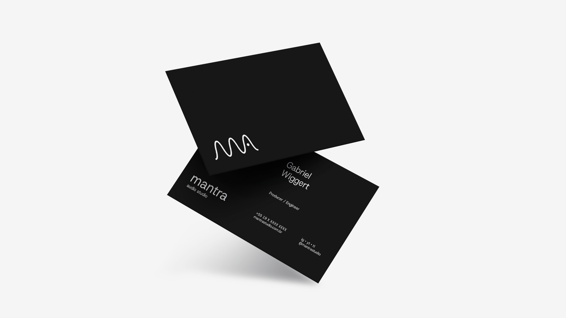
Mantra Audio Studio
Logo Design • Brand Concept
Mantra is an audio studio based in Campinas, Brazil, owned by a close friend and former bandmate of mine. He reached out to me and asked me to design the studio’s logo and visual identity. The concept for the construction relied on a link between the first and last letters of the name and a sine wave, a geometric waveform that oscillates periodically, which notably occurs in sound waves.


 Design & Art Direction: André Guimarães